GTME Problem of the week - the nuances of scoring your TAM
You built a scoring model. You assigned weights. You ran it across your TAM. And then 91% of your accounts landed in the same 10% band. What happened?

This is the most common failure mode in TAM scoring. Well, it’s the most common problem that i’ve run into, and I haven’t spoken to many people about the problem. The model looks right. The weights feel right. But the output is useless because the distribution is flat.
What do I score on?

When I first start building the model, I try to identify a few things
What are the firmographic datapoints → These are criteria like employees, industry (we’ll get to this complex one) revenue, country of the HQ, among others
What are any key technographic datapoints → These are things like tech stack (which is overpriced AF in credits), whether someone has a javascript snippet on their website (s/o RB2B or Unify), or even what items they mention using in their job postings
What are some researchable datapoints that we can investigate, classify, or surface using AI, data vendors, or some combo of them → For me this typically looks like trying to identify how many of a certain profile of person work at a company, such as: sales reps, revenue cycle management professionals, IP professionals. It may be classifying the company as one of multiple potential industries rather than using a generic industry classification, or even distilling various levels of involvement in certain types of initiatives based on website contents.
A criterion I don’t score on - is intent - notably because we want to know which companies are a good fit in general, and then the ones that are in market today, we will devote special attention and detail to. We don’t want our scoring model today to permanently favor companies that had a new hire last month.
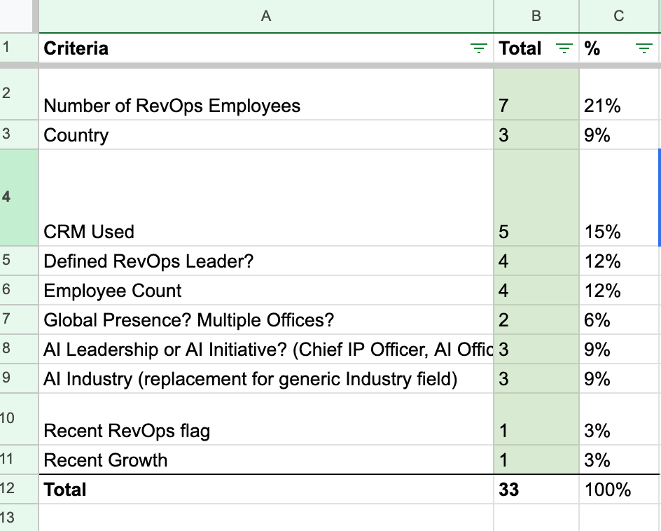
This tees up the actual scorecard, and then we set the values for each one.
What’s next? The part folks skip
This is how most exercises go → build the scorecard, assign some roughly justifiable values, and then sync the results to CRM. In that, most scoring conversations focus on what to score: firmographics, technographics, fit criteria. That’s table stakes. The part that actually determines whether your GTM team can act on the model is the shape of the output.

What I’ve landed up doing most of the time, is building a scoring model that clusters 60% of accounts within a 5-point range. This helps no one, and certainly not the GTM operator running the system.
It’s a shame, you can build a scorecard in a way that feels right but because you don’t know the actual shape or output of every datapoint from a 35K foot view, you won’t build a nice smooth distribution.
Well that distribution ain’t so pretty
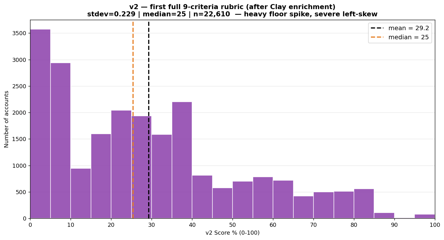
The setup: ~45K companies pulled for a vertical SaaS product. We’d built what looked like a serious scoring model: 9 weighted criteria - industry, rep count, PE backing, sales motion, tech stack, catalog complexity, growth, revenue-per-rep, fragmentation - summing to a 100-point max, with fit and complexity multipliers on top. It looked rigorous. It was useless.
What actually happened:
Half the list - 49% - disqualified before scoring even started.
Of the survivors: median 0.25, mean 0.29.
A wall at the bottom: ~29% of accounts piled into the lowest decile (0–0.10). The single biggest bin by a mile.
Not even a clean skew - a spike at the floor, a second lump around 0.20–0.40, then a thin decaying tail. Dead zones in between.
The top of the scale was empty. Raw points topped out at 84/100, and the 99th percentile was 72. The handful of accounts showing “perfect” scores were multiplier artifacts, not real best-fits.

What happened?

Dead axes inflating the denominator.
Two criteria barely fired. Growth scored zero for 100% of accounts - it never worked at all. PE scored zero for 93% (average: 0.33 out of 15 possible). That’s 20 of 100 points that essentially never paid out. Add tech (53% zero) and rep count (60% zero), and most of the weight budget was unreachable for most accounts. The denominator said 100; the realistic ceiling was ~72. Every account’s percentage got divided by a number it could never hit, so the whole distribution compressed toward the floor.
Missing data scored as zero.
The model couldn’t distinguish “bad fit” from “no data.” An account we hadn’t enriched looked identical to an account that was genuinely wrong. That’s what builds the floor pile - absent data punished exactly like a mismatch.
Mixed populations in one model.
Half the list was off-vertical, DTC, or wrong-segment - companies that by definition score zero on the criteria that matter. They weren’t low-fit accounts. They weren’t in the TAM at all. And they dragged every summary statistic down with them.
Multipliers manufacturing noise.
Multiplying the additive score by fit and complexity factors buckets accounts onto a handful of discrete products. That’s what created the jagged, multimodal shape - and the fake cluster of “perfect” scores at the top.
The fix is kinda boring but it works

The fix isn’t a fancier model. It’s a few mundane things:
Weight by variance, not importance.
The instinct is to weight axes by how important they feel. “Industry fit is critical - give it 22%.” But if most of your survivors are already in-industry, that 22% adds a constant, not separation.
Weight proportional to what an axis actually spreads: roughly coverage × distinct values. We dropped country from a real weight to 2 points (everyone scored the same on it) and moved that budget to revenue, employee count, and catalog depth - high-coverage axes with many bands.
The one exception: a high-value, low-coverage signal. PE backing fires for under 8% of accounts, so pure variance-weighting would delete it - but it’s the whole thesis. So it stays in, as a tie-breaker, not a spread driver. Don’t let the rule kill your best signal.
Disqualify aggressively, before scoring.
Accounts that score zero on every axis aren’t low-fit - they’re not in your TAM yet. They’re noise that compresses everything else. We set aside 58% of the raw list before scoring.
Harsh, but it left a population where every survivor had something to differentiate on. (Set aside, not deleted - a company that gets PE-acquired or crosses the headcount floor next quarter comes right back in.)
Go pure-additive.
Kill the multipliers. Multiplicative scoring feels precise and produces garbage - discrete buckets, dead zones, fake perfect scores. Straight weighted addition spreads cleaner every time.
Normalize into a bell curve.
Raw scores bunch in the middle no matter what. Rank every account, run it through an inverse-normal CDF, and the output spreads across 0–1 with a natural bell shape. Same ranking, better separation - a rep can finally see the difference between a 0.72 and a 0.58. And yes - rank-normalizing imposes the bell shape rather than discovering it, but that’s the point: the normal curve isn’t a claim about the “true” distribution of fit, it’s a coordinate system built for action. The ranking is the truth; the bell is just the most legible way to space it out so a rep can tell a 0.72 from a 0.58.
The model is never checked against your actual customers.
You tuned weights until the output looked right and the top 15 were “names you’d recognize.” That’s memorization, not validation.
The real question: do your closed-won deals and best current customers land in the top tier? If your Performance Food Group / Revance-type accounts score at the median, the rubric is wrong no matter how pretty the histogram. Distribution hygiene and ranking accuracy are two different failures, and the draft only treats the first.
Correlated axes silently re-weight the model toward one hidden factor - usually “size.”
You think you have 9 independent signals. You actually have ~4. Headcount, revenue, PE backing, rep count, and growth all co-move with bigness.
A large company scores high on five axes that are all proxies for the same thing, so “9 weighted criteria” quietly becomes “size, counted five times.” This is invisible on a histogram - the distribution can look great while the ranking is dominated by a factor you never meant to over-weight.
Use Claude Code / Codex to AB test better distributions
To get here the first few times I literally fed the Clay table to Claude along with context and point values / criterias and it will share how to improve
The order matters: fix the weights, disqualify, go additive - then normalize. The bell curve is the last step, not the first. Run it on a broken rubric and all you get is a good-looking wrong answer.
The deeper lesson: two of those fixes aren’t about scoring at all. They’re about not letting missing data and out-of-scope account dominate your statistics. Score quality was never bottlenecked by rubric cleverness. It was bottlenecked by data coverage and population hygiene.
How things improved
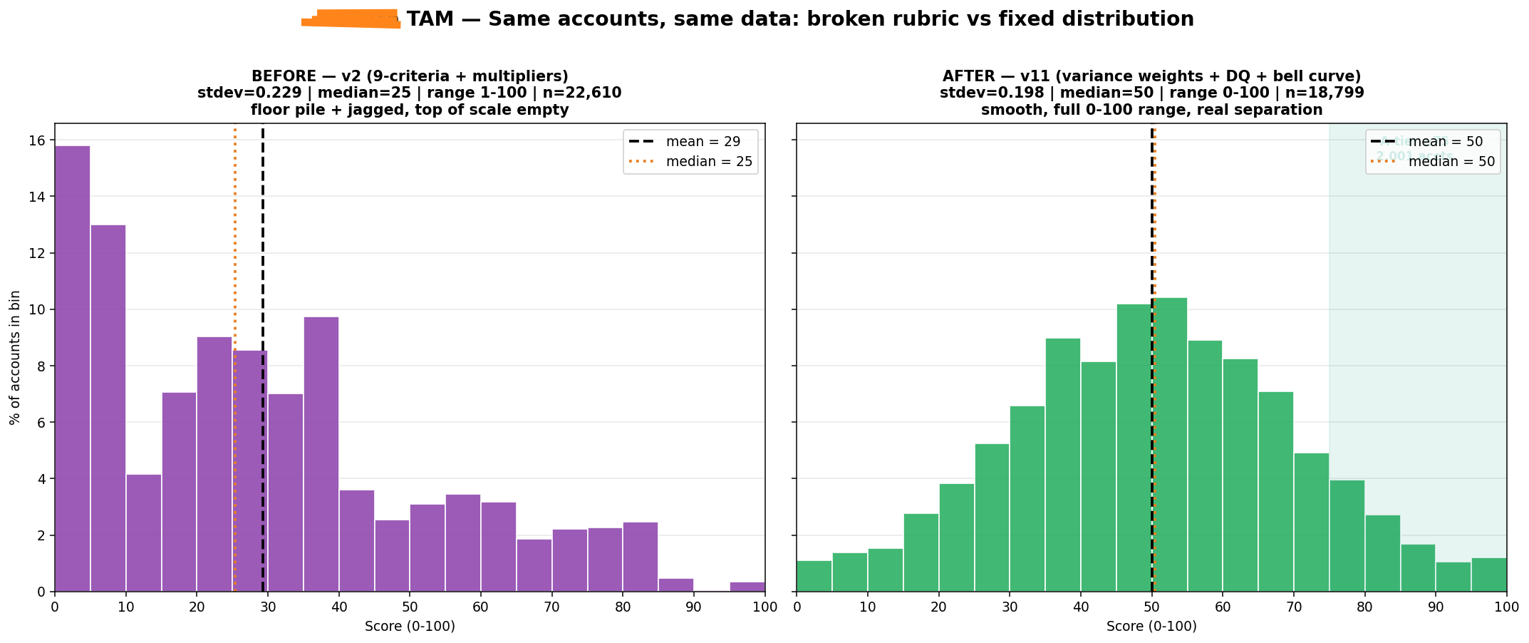
After we made these changes, life was looking quite a bit better :)
Median: 0.25 → 0.50. The mass moved off the floor and into the middle, where you can actually work it.
The floor pile dissolved. ~6,500 accounts bottomed out before; under 3% sit in the lowest decile now.
A clean bell, full range. 0.00 to 1.00, smooth, no dead zones - instead of a spike and a tail.
A real top tier: 2,001 accounts above 0.75, and 7,482 above 0.55 - a usable best-fit cluster, not a scatter of artifacts.
The top 15 are all names you’d recognize
Why this matters for TAM Score distribution
A compressed score distribution breaks everything downstream:
Tier assignment is arbitrary. If 80% of accounts are within 5 points of each other, your A/B/C tiers are random. Reps don’t trust them.
Routing is random. Score-based lead routing becomes a coin flip when scores are clustered.
Prioritization doesn’t work. “Work your top 50” means nothing when #1 and #500 are 3 points apart.
Outbound sequencing has no gradient. You can’t write different copy for different tiers if the tiers aren’t real.
A good distribution is the precondition for everything your GTM team wants to do with the model.
For the future

Before you ship your next scoring model, check these:
What’s the stdev of the output? (Target: ≥0.12 on a 0-1 scale)
What % of weight goes to saturated axes? (Target: <15%)
What % of your TAM scores 0 on >half the criteria? (Those aren’t low-fit - they’re not in your TAM)
Do your buckets have gaps? Plot the histogram.
Is the output bell-shaped or cliff-shaped?
If the distribution is wrong, the model is wrong - no matter how good the criteria look on paper.
Garrett